When we last left our hero he had drawn
and inked all the stuff on his next NFT that he was comfortable
with, and was preparing to do the trickier work.
Unbeknownst to him, he was about to
embark on a tragic journey of making his life miserable by
trying to use the simplest of digital art technology. It's not
that I don't know how to use art software, it's that I tend to
merge traditional art techniques and digital art techniques
together in ways that are...unwise? not recommend? ass
backwards?
and also sometimes I don't realize I
did something right until it's too late.
What I wanted for this piece was to
have a look and feel that hearkened back a bit to the old pulp
fiction sci fi magazines...
That requires an imagination grabbing
fantastic illustration ( that part I'm fairly good at) and
lettering that has a bit of pizzaz, charm, energy. I am okay at
that...not great, but okay. SO...I thought to myself...how's
about I live in 2021 and use the computer to create the
lettering? Plenty of programs and tools that can be used to make
and modify words. I even know how to use these programs!
In most cases I am very strict about
hand drawing every single aspect, but even the old masters of
the pulp era used stencils and "rub on's" and short cuts. So I
feel that using the computer for lettering is fair, and in the
spirit of things, and does not harm the overall look, and feel.
You can make the title digitally and do plenty of stuff so it
seems genuinely retro.
and I DID!!! After some screwing around
and just modifying haphazardly until I was happy, I got a title
that looked pretty great! I printed out a copy, laid it over the
illustration and it did in fact look good!
Then I moved onto some other stuff,
turned off the computer...called it a night.
Oh yeah...you know what happened.
I didn't save the file and I had no way
to recreate the title because, frankly I don't even
know/remember all the jacking around I did to get it right. All
I had left was the print out that I had crumpled up and threw in
the garbage.
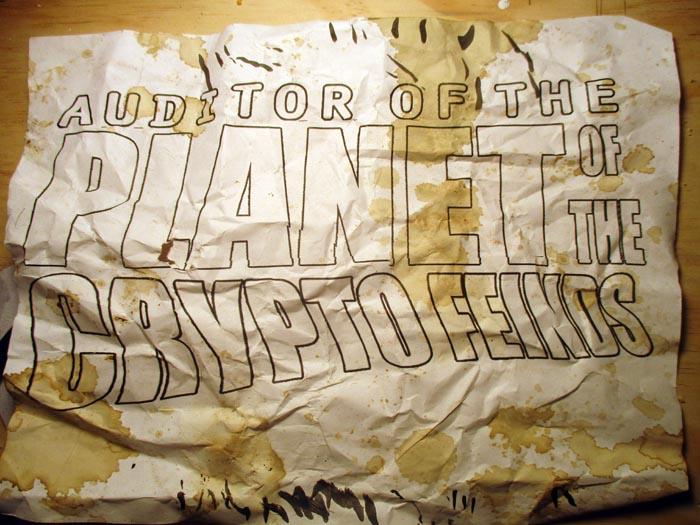
...uhm...another fine piece of modern
technology is a light pad. It's just what it sounds like.
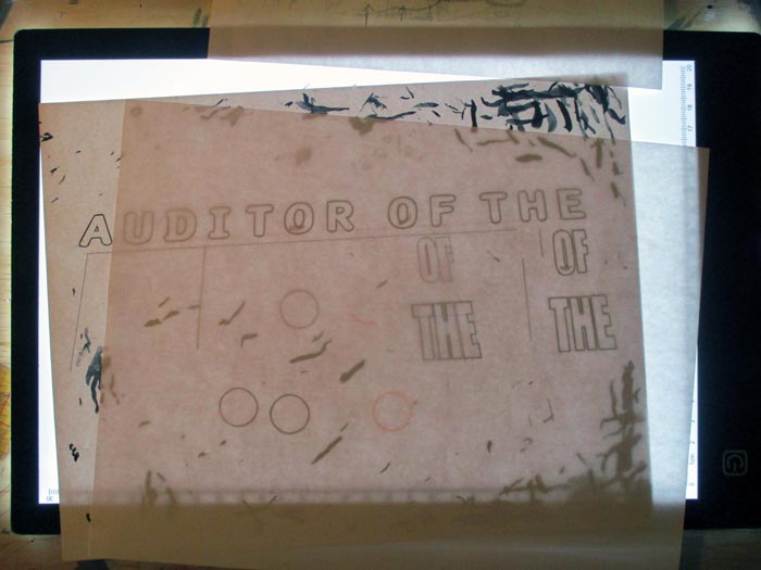
It's a pad that just shines light up so
you can trace over stuff...like a crumpled up logo. So,
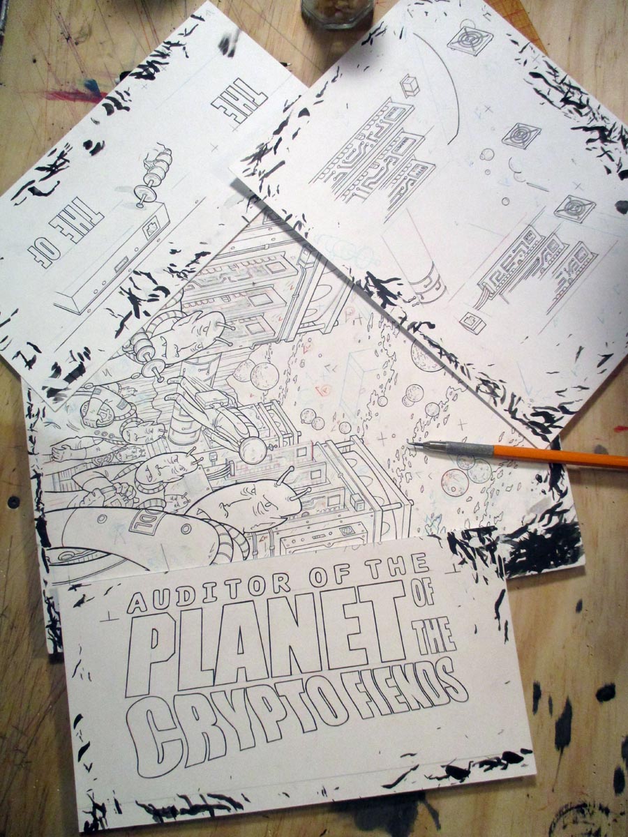
yeah...thanks to me not saving it I had to trace and hand letter
and hand ink the f'ing title after all.
People often ask how I got so good
using an ink brush. The answer is simple, I'm a f'ing idiot and
I get plenty of practice. BUT, all's well that ends well.
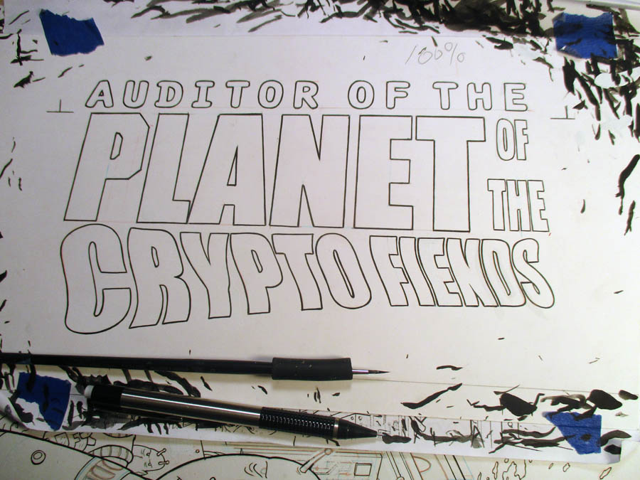
After all of that...the thought of
inking the lines on this that I was nervous about ( particularly
the circles that needed a lot of precision) almost felt like a
reward. These hardly seem like a problem at all after inking the
letters
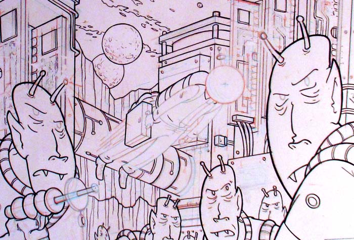
I'm not one to beat my chest about how
awesome I am, most times the best review I give anything I've
done is "turned out decent", but THAT space helmet turned out
fucking great!
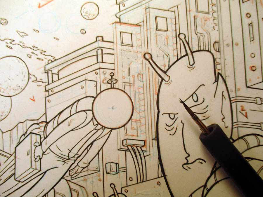
No two ways about it...that is bad ass!
Look at that brush...and look at the circle I made with it...I
am pretty good at this, eh? OH...and it's a glass helmet so to
my satisfaction it needs a double line to imply the thickness of
the glass...
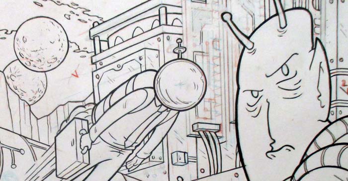
there, that's better..that's pretty
good.
From there I inked/touched up the
mining units that I was pretty sure I wouldn't use
anyway...because...why not, I'm on a roll!
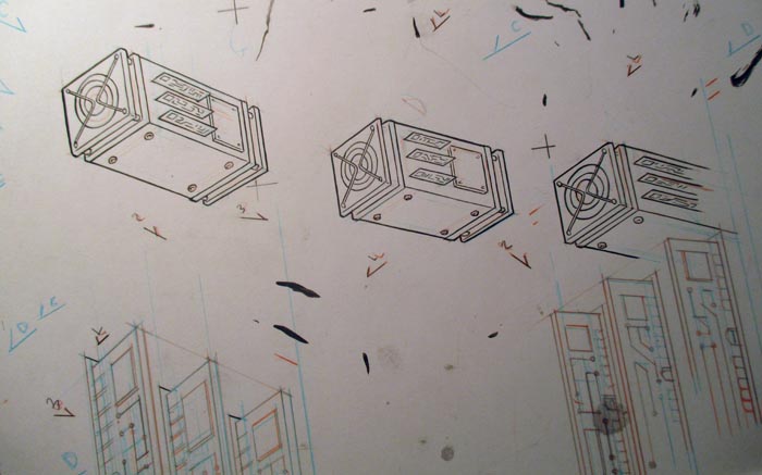
Did those on separate piece of paper to
add on top digitally and see it they'd look good or not. I also
had to redo a bunch of things on separate pieces of paper to be
layered on digitally, because I had so many failed attempts the
white was too thick to deal with, or the paper was to
compromised for constant erasing ( you erase on one spot enough
times and the paper gets weak/fuzzy and the ink will just bleed
right into it and you'll never get a good line)
so all of these blue parts got redone
on a different piece of paper
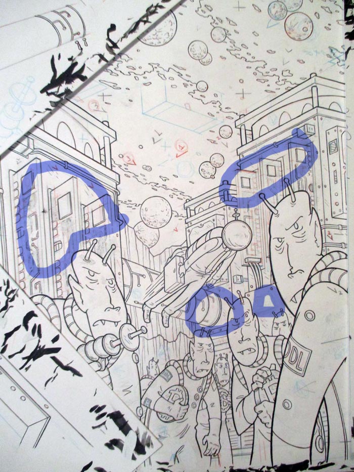
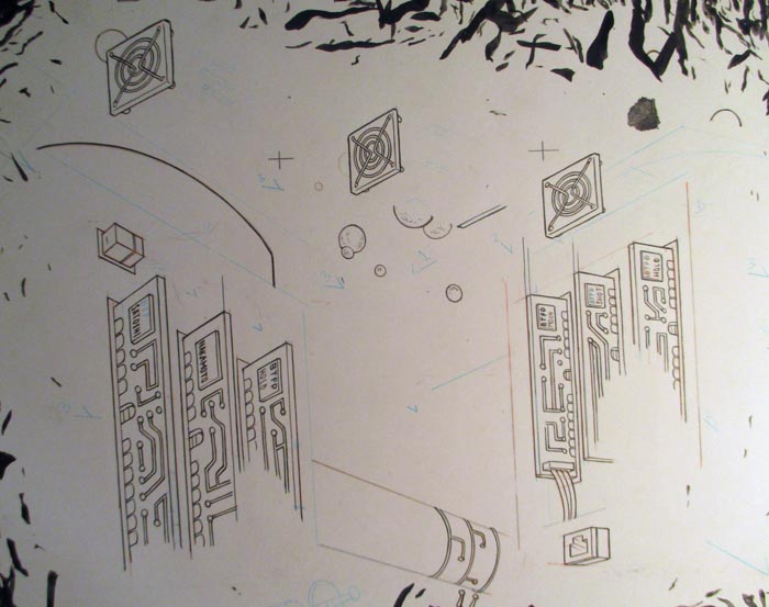
below here we got the circuits and
other stuff...and the screens for the crypto units because I
didn't get those right the first time. It's a real pandoras box
once you start redrawing stuff to just put on top of mistakes.
ANYWAYS....once the inking was done I
gave a look at the thing with and without the crypto mining
units on the top
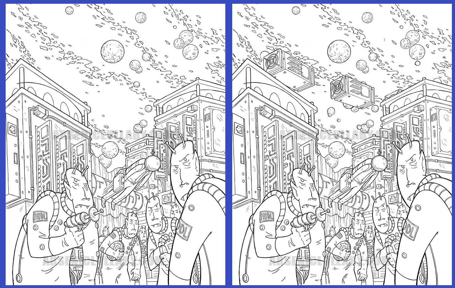
It's...kind of fine either way. It's a
matter of preference, do you like things that are visually
complicated or do you like the composition of a piece to be it's
strength?
Wally Wood was one of the most skilled
illustrators in all of comics, and his career had a "cluttered"
era...
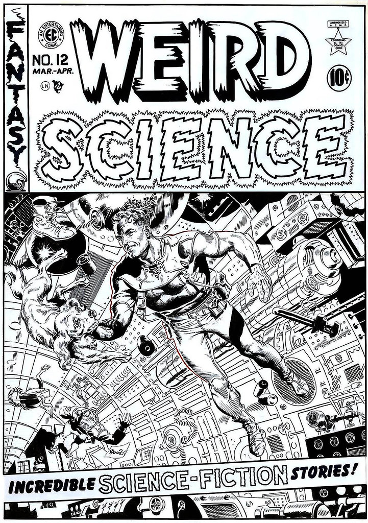
Which many people loved. But he later
had a less detailed but more composition-ally focused era, and
some people loved that!
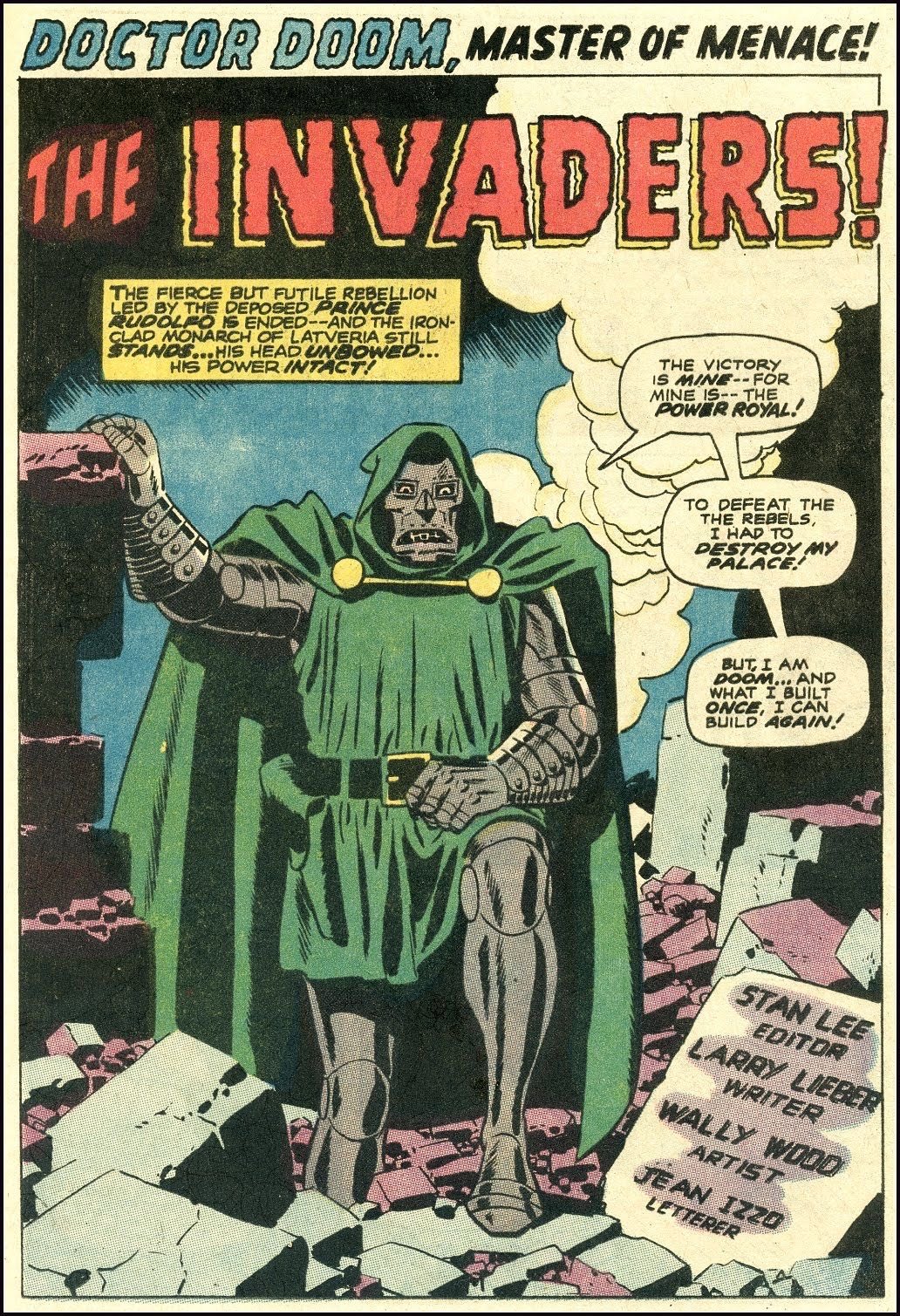
Some people like both his eras equally.
Back to my NFT, I kind of like the
units on this piece, but I also like it without. Technically
having them does aid the composition in the "golden ratio"
because...oh....
wait a minute...
This thing's gonna have that fancy
title right smack over where the units would be. Cripes,
yeah...those can't be on there. That'd be a complete mess. ( I
later checked and trust me...it was a mess).
Well...hell...maybe I'll use them on
something else some other time.
In any case, THAT is the end of the
traditional art work to be done on this one. I must say, I'm
pretty pleased with it.
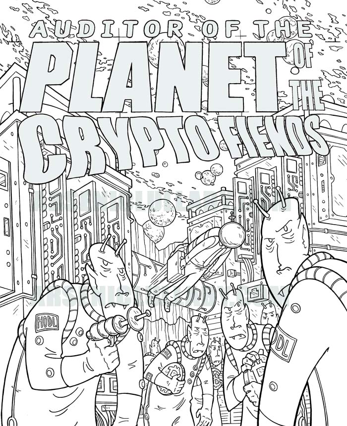
NEXT TIME...I''ll show you the final
NFT and explain some techniques and effects I've added to
it...experimenting with moving the readers eye, and giving a
sense of timing to an illustration that is technically
un-moving. Taking some traditional tricks and combining them
with the fluidity that the gif format allows. You'll see what I
mean.
Until then, here's a sneak peak of what
it looks like in color...
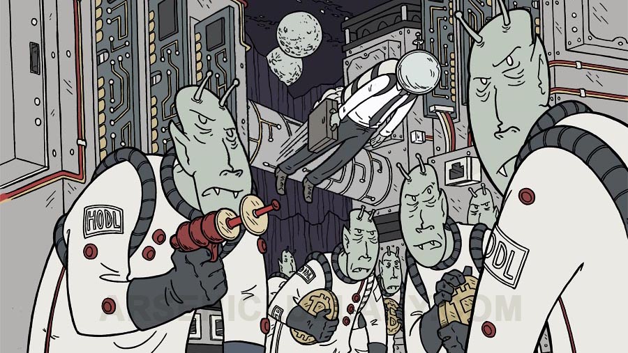
later