BEHIND THE SCENES AND PREVIEWS
Planet of the Crypto Fiends part 3
So....when we last left this project I was doing for Josh
Blaylock
www.comicboxels.com we had ALLLL the line work done, the
title done and ready to color.
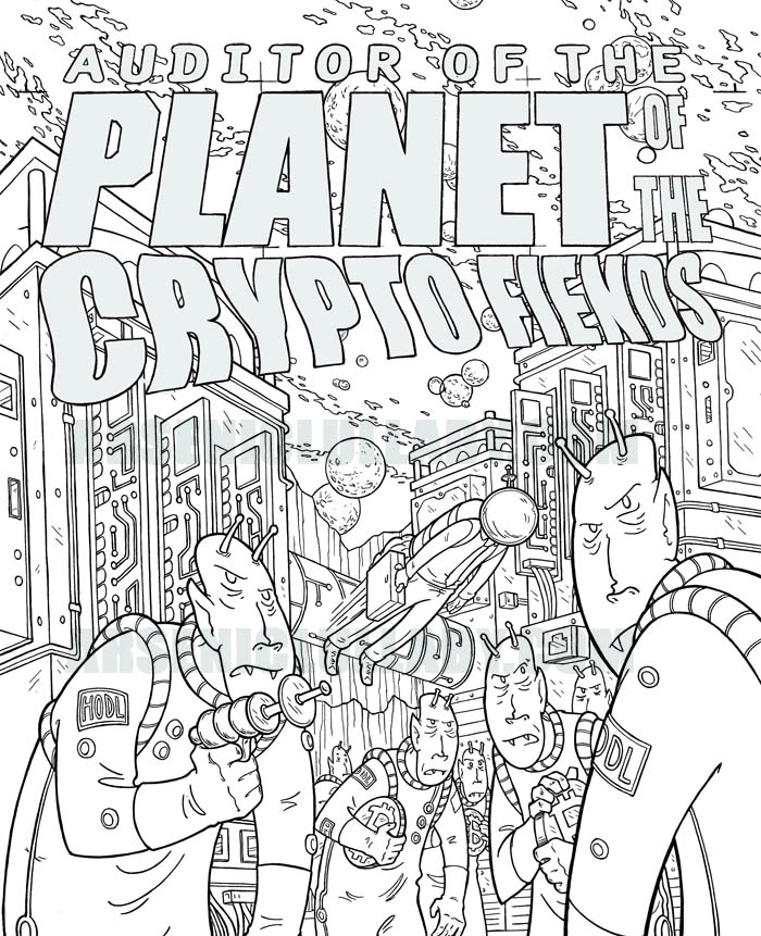
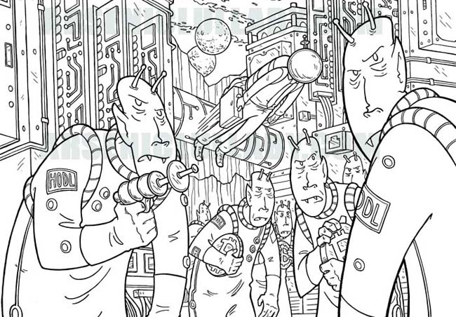
Intricate detailed linework being my hallmark, coloring
always feels like a necessary evil, there's a give and take to
things and the more the colors stand out...the less the linework
stands out and visa versa. ALTHOUGH, as a gif I can do a little
something about that usual balance. Let's first color it. I
initially had in mind an old pulp magazine type feel, and
yet...a little modern color tone was worth experimenting with,
particularly on the logo. After much mucking around and too,
what for ME, was a few risks and finally ended up with something
I was happy with...
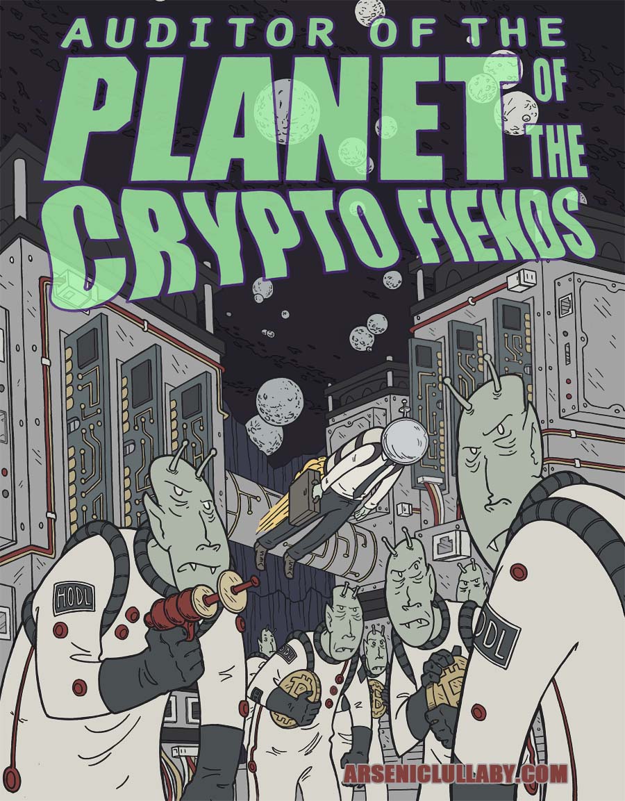
But so far...this could easily be a printed piece, not much
about it takes advantage of the digital art possibilities of gif
and the nft world. Not that you need to use more tools than you
want. Plenty of really good nft work could also be printed. BUT
I had a few things I wanted to try, and a few issues to solve.
There is of course the title, I knew what I wanted to do
with that right from the beginning...
Something that vexes me a lot, is that because my work is
usually pretty intricate, pretty...uhm...crowded? all
encompassing? what's the term I'm looking for? There's a whole
lot of detail to take in, that you really can't be confident
people will notice. With some much going on visually it's easy
for vital things to get lost or not be as striking as you want.
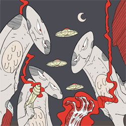
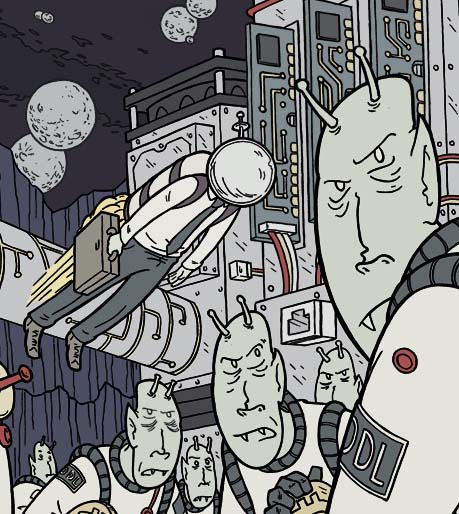
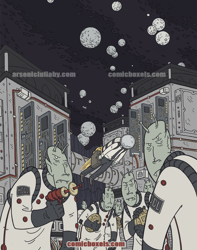
In this case the little guy with the space helmet does get
center stage in the composition, but there is so much detail
everywhere he doesn't jump out as much as I'd like.
If
this were in print, I could either just accept that or have less
detail around him. But this being a fluid medium, I can tweak
some things, give the piece a rhythm and have him be sure to get
his warranted amount of attention. (give this a second or two
while you're looking at it)
With that ability to tweak in mind I'm
able to unchain from another element of standard composition.
The center of the picture always gets some visual attention
because it's in the center, there are all sorts of ways to make
something that is not in the center the eye grabbing focus...but
the perception of timing, as in what happens first, second,
third is a bigger visual obstacle... the viewer is going so see
a piece and view it from left to right, because they have, over
the course of their entire lives, been reading from left to
right (unless you're in Japan, but that's still the same issue
just in reverse).
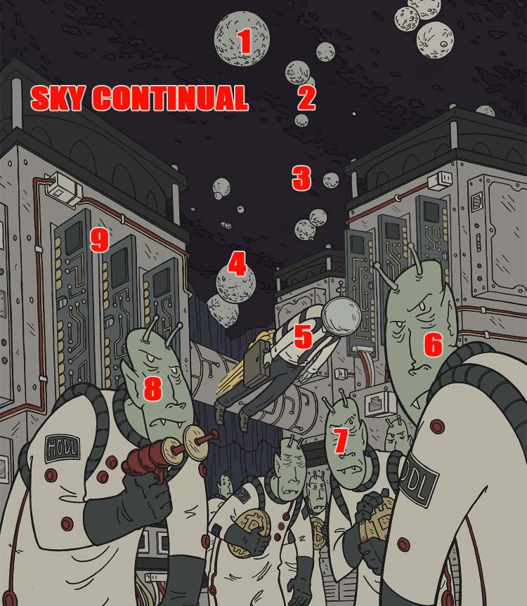
So using this as an example,
The visual timing would be absorbed as,
the alien pointing a raygun, then the little guy he is about to
shoot at, then the crowds reaction to the little guy. That's not
really the visual story/timing I'm trying to convey. What I want
is the little guy, the alien reacting, the crowd reacting, then
someone ready to blast him.
And, as in most cases, I'd like the eye
to circle around instead of being lead off of the
page/cover/piece in one direction or another.
So...I made some decisions on what
order things should get some attention and the road map for
tweaking was basically this...
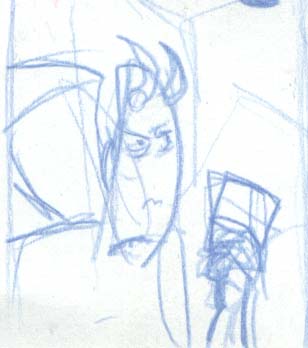
I'll show you one of the trials/tests, without the color so it's overly
clear and obvious, instead of more subtle like in the final
piece...
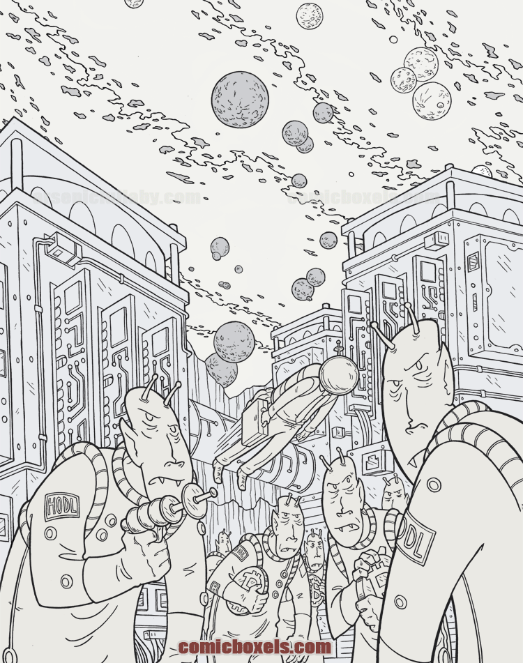
hmm...that's kinda cool just like that, now that I see
it only black and white. I'm going remember this.
Anyways...each element fades in, gets crisper in a rhythm and
order that I like. Basically leading the readers eye to all the
elements I want so nothing gets left behind, yet nothing has to
be at odds with anything else. It can be an overly detailed
piece and still have things that stand out dramatically AND
several things can stand out dramatically. The composition
itself is ever changing because the visual focus is changing.
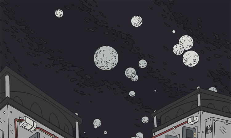
Even the background structures gets a moment to shine
it all took a good amount of trial and error and
figuring out what techniques to fade in and out with and in what
order and in what rhythm, but I gotta say, I pretty pleased with
this one...and figuring out new techniques that here to for have
not been available/invented/used, is pretty damn fun.
Fuck you, everything we know about standard composition!
Now that THAT is done an explained...how about heading over
to http://comicboxels.com to see it in it's full sized glory!
That's where Josh Blaylock's home base is and he is got a LOT of
cool nft publishing stuff going on. A...LOT. Aside from myself
and this fine piece, he, as well as two other comic book elder
statesment- Howard Chaykin, and Bart Sears have NFTs up!
AND...AANNNNDDDD...If you win my NFT, you get all the original
physical art OR can tell me to burn it. as in actually burn it
with actual fire. After 30 plus hours of working on it, it would
bring me great delight to watch it burn.
https://www.comicboxels.com/