
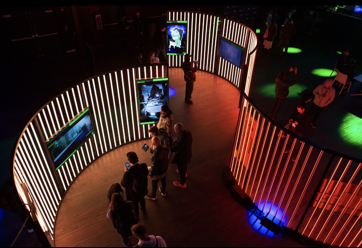
a month or so ago I got an email letting me know I had been curated to bee a part of the dreamverse art gallery in NYC on nov.4 !!!!!
https://www.dreamverse.life/
It is a large
event with live music, a showcase of Beeple's nft
art, nft art of 10 OG nft artists and artists that
had been personally curated by those OG's. It is one
of those, once in a lifetime...pioneering into the
new...opportunities to do something that is
groundbreaking.
It's being produced by
metapurse https://twitter.com/Metapurse and TIME
magazine had a hand in it as well...in ways I didn't
figure out because once I read the email I realized
I had to get my ass in gear in order to get
something good done in time!
As shown to
me via email. the live nft art gallery will have
these big ass screens arranged for the attendees to
see the works, big and beautiful!
You regular readers may already know I am
driven by competition, which fueled part of my
ambitions in this instance but also...to be
nominated by someone...someone who could have used
that nomination for anyone they choose.
well...that's an added spark, because I am
NOT....absolutely NOT going to let that person down.
So...motivation is all well and good, but I
still gotta come up with something. In an instance
like this you kinda want to do something that sums
up what your work as a whole is. IN the case of
Arsenic lullaby that'd be- weird, dark,
precise...existing in a world all of it's own. (feel
free to ignore that if it's being self serving)
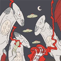
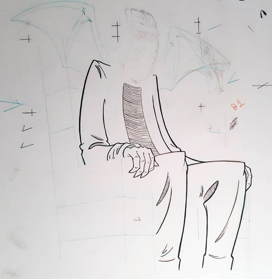
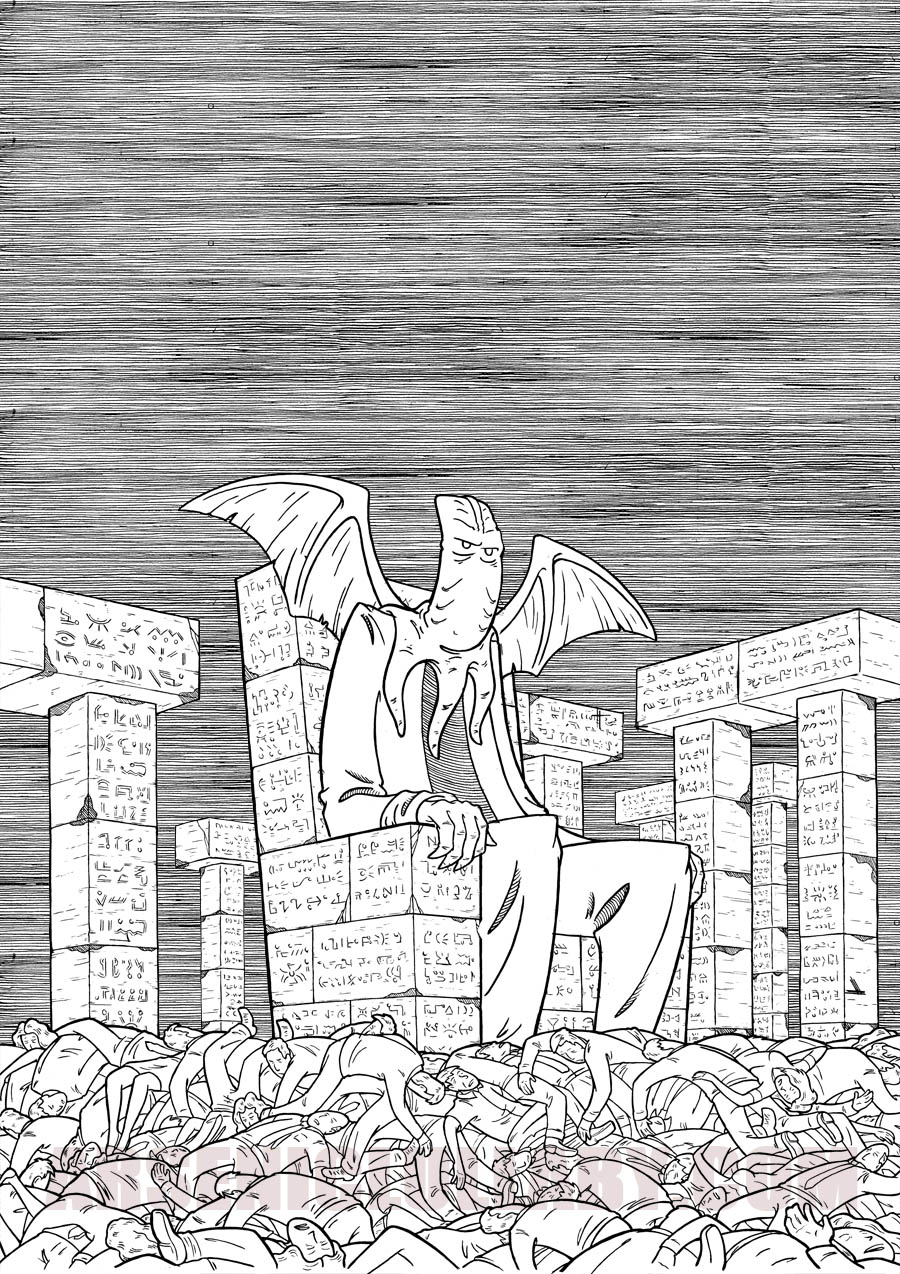
the rough sketch was this...
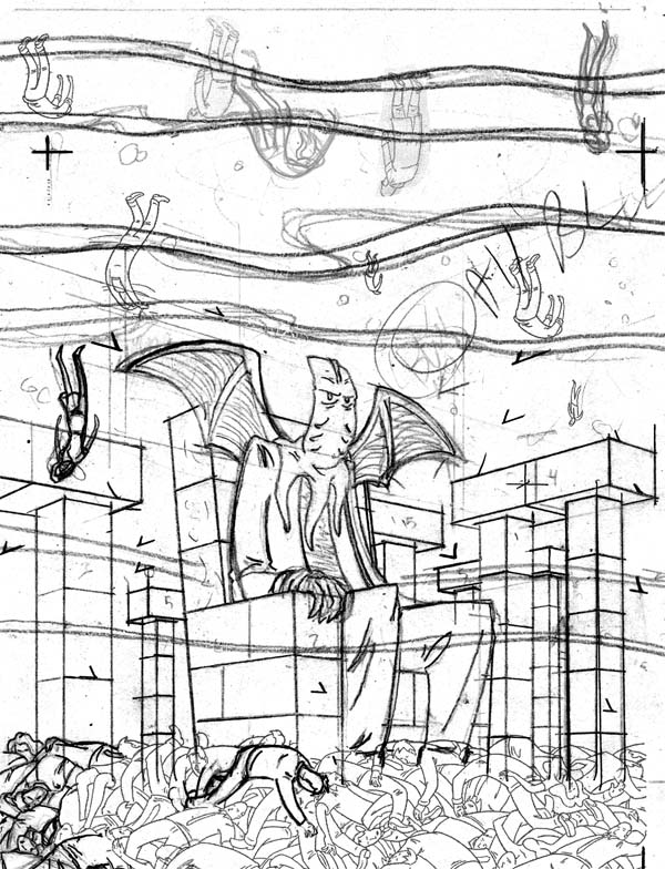
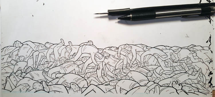
...The A.L. version of Cthulhu on his throne in
the murky depths as remnants of humanity fall around
him.
In my head, the bodies are sinking, the
undercurrents are drifting and he is only semi
invested in any of it.
All of which sounds
cool and looks good in my head, but would take a
solid amount of work to get done
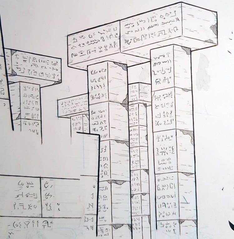
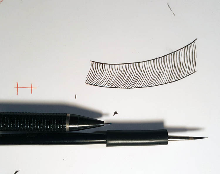
I work
traditionally, each and every element drawn and
inked by hand with pencil and brush on paper THEN
scanned in to be added together digitally. So if a
body is going to fall they have to be illustrated
traditionally...
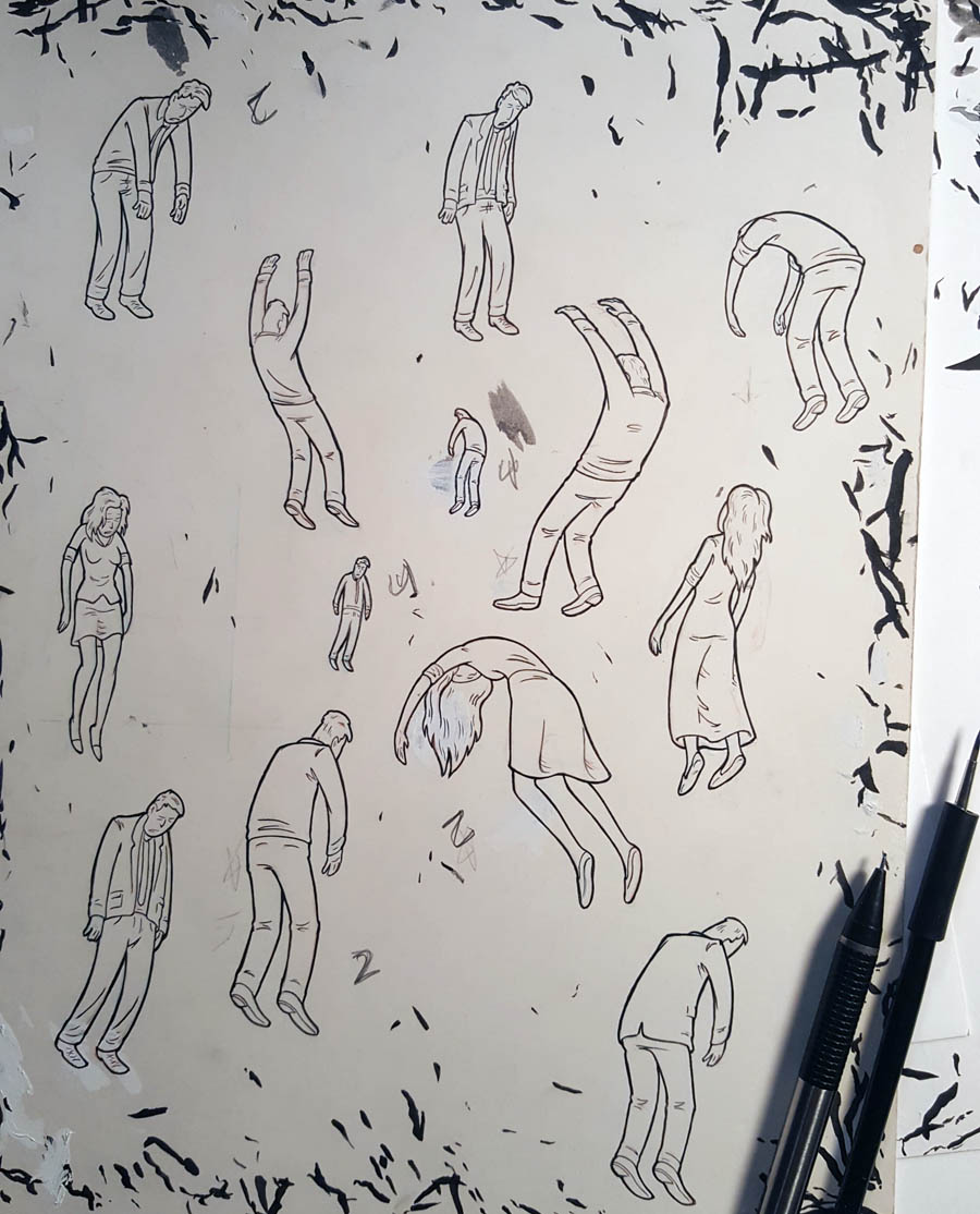
if a body falls onto him and is shrugged off,
each movement is drawn traditionally...
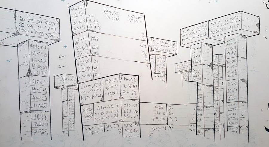
the background...lemme just show that off a
little, because it tuurned out better than I thought
it would (luck is the residue of desire, as they
saying goes)
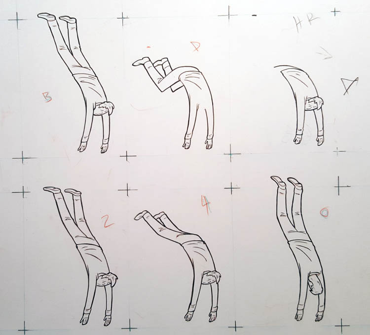
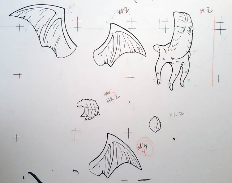
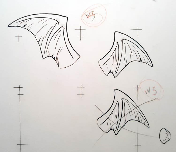
If the wings move...they need a different
illustration for each position ( I won't make you
scroll through every cell/aspect of this piece, but
you get the idea)
the line on that shirt...after some
consideration...that was sub-par. BUT I'm not a
total Luddite, I didn't redraw the entire
body...just the shirt lines, then added them in
digitally
until eventually I had the line-work done to my
satisfaction...
now...I did say every single line was inked with
a brush, yes? because you might be looking at that
background and thinking I am a lunatic...and you may
be correct in that assessment
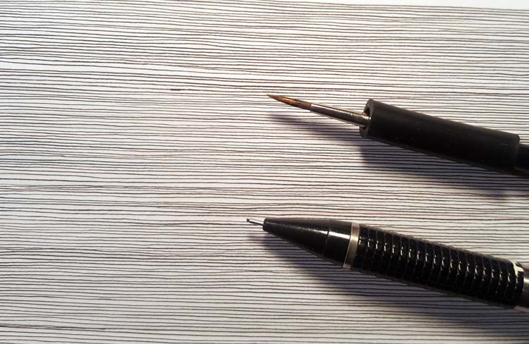
Tedious?a little. Insane? maybe. But I am known
for a certain look, and was nominated by someone and
I'll be fucked if I am going to let them down.
after all that...animating the thing is almost
relaxing. You just add the individual scans/cells
correctly and decide on a speed. Most animated
cartoons you've seen move at 24 frames (pictures)
per second. 12 frames per second is legit but not
used much anymore. I go about half that rate, 6
frames per second, to give it a little clunkly
charm. to my mind, just like using a digital brush
which never varies the line width, having the
animation too smooth can also make something so
polished that it feels sterile. In the end, it's all
moving at a rate that the eye can't see the
difference anyway but...these are the tiny
differences that you tell yourself matter.
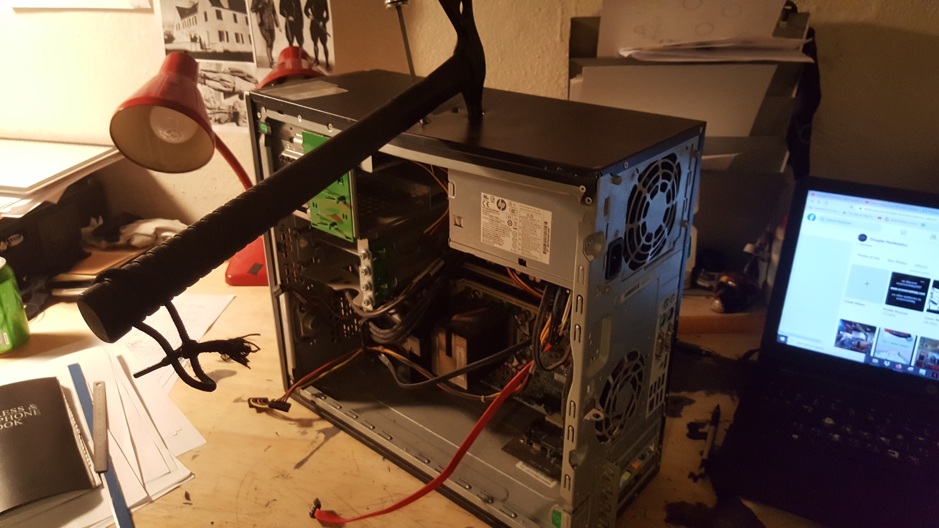
and...then the computer dies...taking hours of work
with it. NOW, in younger days I would lose my
tempeter, thow a fit, maybe smash the computer with
a baseball bat, maybe take i outside and empty my
shotgun into it. ,,,don't look at me like that, you
none Americans, if your computer did that to you and
you had the option of pupping it full of lead, you'd
do it in a heart beat. But, I am more mature now,
and tlosing your patience accomplishes nothing and
having to talk to the police for several hours
because your neighbors called them because you were
cursing and firing a gun at a computer in the back
yard wastes precious time...AND someone nominated
you for this project and you are not going to let
them down.
...all the
same...pragmatically...a price has to be paid for
failure...
hmmm...that's not quite cathartic enough
that's better.
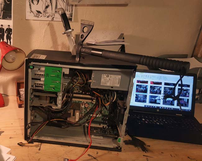
Moving right along...then
you salvage what you can from the hard drive and
re-do the sunovabitch
I'll first show you
the animated gif in ONLY black and white.
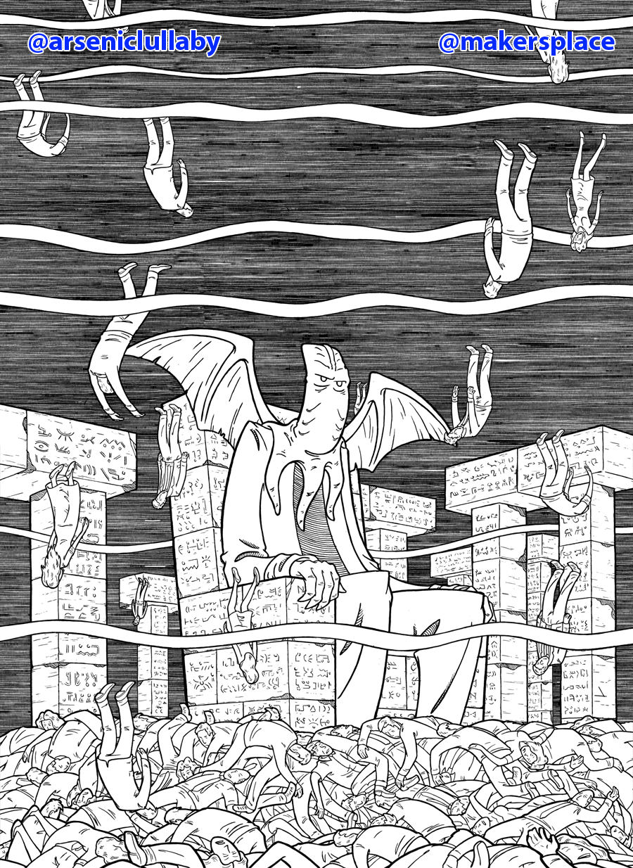
***https://makersplace.com/arseniclullaby/***
During the process, I kinda really liked the b/w
version. It's not something you'd put out in
competition with the greatest nft artists in the
world, lest you wanted to look like you were being
different for the sake of being different...and the
color version is actually what I envisioned the
whole time. BUT I do think the b/w version stands on
it's own in a different way. captures the
imagination in a different way. Heard of Edward
Gorey? He's worth googling. His work is marvelous
and would just not be the same in color. SO...with
that in mind I mined a b/w version along side the
color gif that will be shown at the dreamverse event
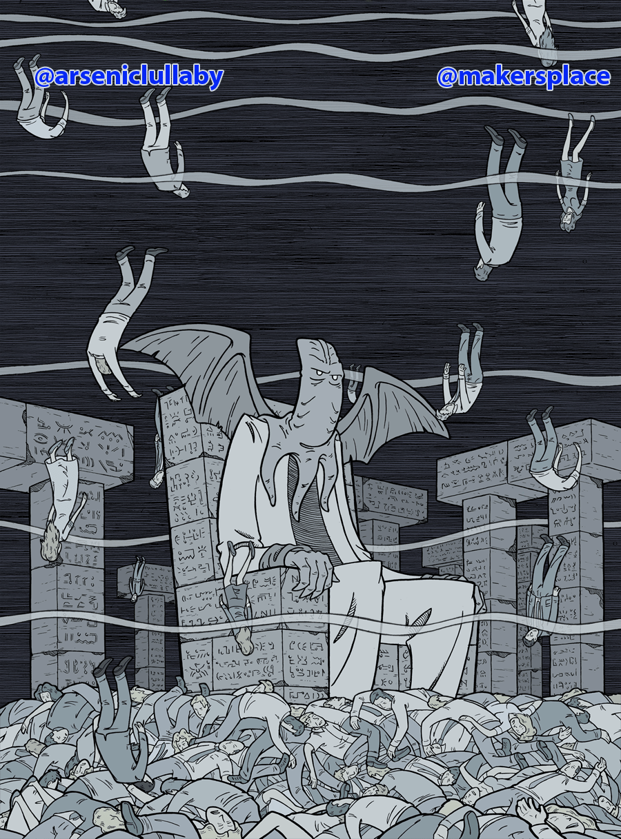
***https://makersplace.com/arseniclullaby/***
It's all minutia at a certain point but if
you look close, the waves on the b/w are a bit
thicker that in the colored version. That is to aid
the optical illusion of movement in each instance.
(these are things you learn when working on a b/w
comic book) . the background lines are more apparent
and obvious in b/w so the waves can be bigger
without being overbearing visually. But in the color
version they need to be a little thinner and more
subtle lest they stand out too much. Also in the
color version I can have the background and falling
bodies be just a bit faded by the waves, adding
another element of depth to the piece.
I'm
pretty happy with this to be honest, and I don't say
that often, especially after I just finish something
I spent 50-60 man hours staring at. as usual though,
the thing that cracks me up the most is the thing
that most people won't ever notice. The tiniest
figures furthest in the background...for some reason
that really busts me up. They are too far away to
matter to Cthulhu at all. Like raindrops that never
hit anything important. Their existence ends at the
bottom like everyone else...yet they, even in that
final fall, don't really bear much notice.
And that's that. I hope whoever nominated me...that
I lived up to your recommendation. I am EXTREMELY
honored to be a part of this.
The b/w gift
will have 5 editions at a lower cost (so that people
who usually can not afford my work can own a piece)
The first b/w will be listed at .07 ETH and the
price will go up with each edition until, inevitably
they all have a home. So "get while the getting is
good" as my Dad used to say.
and the color
version that is being shown at this event is a 1 of
1. Only ONE person will have ownership of the piece
featured at this event.
They are both here-
***https://makersplace.com/arseniclullaby/***
You can can see more blogs laying out how my
bft's are made, and see the entire A.L. nft library
here-
https://www.arseniclullabies.com/nft.html
More of my NFT art can be found here - https://makersplace.com/arseniclullaby/
More behind the scenes pics of other nft work- http://arseniclullabies.com/nft.html